Platform Design
Clover Health needed a design system for integrating its internal tools in a way that would allow the various teams to learn, grow, and build on a consistent, solid foundation.
My role: Design Lead, User Research, Information Architecture, System Design, Prototyping, UX, UI, Visual Design

Objective
Clover Health believes that empowering people with good tools and data will improve health outcomes for its members. That’s why they’re building almost all of their tools in-house, as a unified “Mission Control" UX.
When I joined, most of the tools were spread across multiple services with little consistency. Some were outdated and unreliable, while others didn’t exist yet.
The goal was to create an integrated “platform design” for Mission Control that could scale as more tools got added. But before we could do that, we needed to understand the business vision, people’s roles and how their tools factored in.

Success would require connecting with key people on various teams. We needed to learn how the different teams functioned (or why they didn't). And then we could start to distill insights into how to deepen member and provider engagement, and streamline core operations such as claims processing, utilization and more.

Challenges
Because Clover Health (a startup) was hiring lots of product managers, and kicking-off many new projects, the platform design had to be simple and fast: a rough yet consistent framework to support the incremental, rapid growth of our emerging infrastructure.
Time was also a challenge since this project had to take a back seat to more urgent projects.

Approach & Process
We started off by interviewing our chief medical officer, customer experience leads, ops, member enrollment, provider relations, wellness managers, nurses, and other subject matter experts.
We began to develop a feel for the big picture, the day-to-day and to weigh short-term versus long-term goals. We also had a lot of close collaboration and guidance from senior stakeholders (mainly via whiteboard sessions) in our weekly product-design team reviews.


We soon had enough of an understanding to begin to sketch out a scalable, high-level IA.
Our basic IA model worked well for the member and provider content, but workflows and reports content needed to be elevated into their own space.
Once these fixes were done, the basic framework was stable enough to accommodate the other required content and workflow types.

We then created journey maps to get a deeper understanding of the different roles, how they interacted and where we could have the most impact.
Armed with these artifacts, we could now more easily step into the user's shoes to grapple with questions such as: "would this IxD model work for this person — versus that person?"
We kept things low-fidelity for as long as possible. Many sketches and whiteboard sessions later, after conducting concept validation research (on site in San Francisco, Jersey City and Laredo), we arrived at a "straw man" IxD model for the Platform Design.

The IxD Model
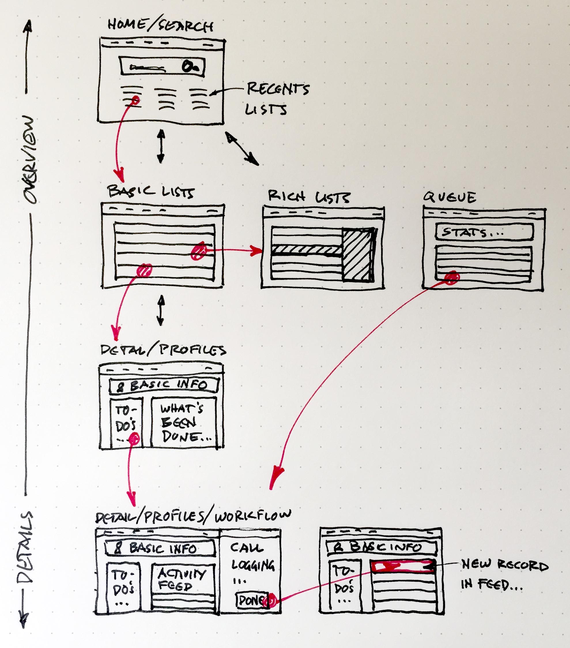
At the Overview level, users start tasks from List pages. Lists can be basic or rich. From Lists, users can see just enough info to make a decision, or do basic actions. But for complex actions, they’d click deeper to a Details page.
All Detail pages would have a “Basic Info” card at the top, with key info to set the general context. Typical Detail pages include the Member Profile and Provider Profile, but this page type could also accommodate content for a Claim, or an Authorization.
An "action tray" would slide in from the right upon initiating complex, multi-step workflows (e.g., member or provider outreach). As tasks get completed, new records would appear in the Activity Feed (in the Detail pages).

With limited time, we used the other "more urgent" projects to test our Design Platform hypotheses. Participatory design sessions with subject matter experts proved valuable and fast. And our Product Design team also met on a regular basis to share Design Platform learnings, progress and tweak the direction as required.


Result
This work helped Clover Health to avoid costly technical and design debt while accelerating improvements to Mission Control. We also helped Clover to work through a complex business problem by focusing on our users and understanding how they'd find value in a consistent, overarching Platform Design.
We provided a robust foundation for the new platform, in a format that our development team could utilize without direct communication. Our limited set of page templates (driven by our design principle of reusable, flexible objects) has helped Clover to scale rapidly.
We rolled out our Platform Design on our Provider Directory product in March 2016. The overarching content strategy of the information architecture, as well as the patterns and templates, have held up.
Learnings: Design systems are more than UX/UI patterns or style guides; their success depends on how teams work together and the team's shared values & principles.