
Provider Directory
Clover Health needed a centralized, intuitive tool for managing its provider data.
My role: Design Lead, User Research, Information Architecture, System Design, Prototyping, UX, UI, Visual Design

Objective
Empowerment & Transparency:
• Create a UI to manage provider data, and an improved service to support providers and members
• The legacy tools were confusing; we needed an intuitive tool for a rapidly-growing team of Call Reps
• Change the mindset from "this data is terrible" to "I have the same information as everyone, and it's my responsibility to fix it"
• Bring transparency to the data; empower everyone to improve it

Challenges
How bad was it?
• Too many clunky legacy tools (iNetworks, Facets and others) caused poor data quality; it was hard to tell which providers were "in-network" (contracted and credentialed)
• We were giving members inaccurate provider information; sending them to wrong locations could put their health at risk
• Insurers are required by law to verify provider data; it affects star ratings; worst case could mean being shut down by the government
• Multiple reps were contacting the same providers; over-reaching led to angry providers, loss of confidence in Clover
• Doctors were getting paid late, or at wrong addresses
Business Value:
• Centralizing provider data into Mission Control would let us crowd-source it, accelerating improvements to it
• Better data would help us send members to the right doctors, improve outcomes; and pay doctors faster (happy doctors are more likely to advocate for Clover)
• Improving data quality would earn Clover increased: star ratings; revenue; control over how to advertise

Approach & Process
Step 1, EMPATHIZE:
Discovery Interviews:
• 1a. Customer Experience Coordinators (Call Reps) in Jersey City
• 1b. "Ride-alongs" to provider offices, with our Account Managers
1a. Call Rep Highlights:
We interviewed and shadowed call reps, asked what worked or didn't — and why. After a week, we developed a feel for the workflow. We followed up with collaborative design sessions.
We spoke with:
7 Call Reps:
• 4 Reps (100% phone support)
• 3 Leads (50% oversight, 50% phone support)
Common comments [and our insights]:
“Members call a lot to ask if a doctor is in-network. They ask about eligibility, benefits — they always bring up other stuff...” [It's a conversation; the tool must be flexible.]
“Often, when we search, we can’t find a doctor. We need other ways to search... A doctor will be in iNetworks or Facets, but not in Mission Control — sometimes I don't use it…” [Mission Control was failing.]
“A provider's specialty is just as important as their NPI... Also, Reps need to see which office is their primary." [Make key data glance-able.]
“We'll triple headcount soon… We hire for warm, empathetic reps — they don't need prior healthcare experience… Legacy tools have too much jargon… " [Legacy tools confuse new hires, obstruct growth. Training isn't an option.]

A few Clover Health Customer Experience Coordinators (aka Call Reps).

Identifying five types of providers that work with Clover: whiteboard from a session with our CMO and our Provider Alignment Leads:
1b. Providers and their Office Managers:
We interviewed our Provider Alignment Execs and our CMO. Their input — combined with our "ride-along" provider office visits — proved useful in developing Provider Personas (see below).
We wanted to learn:
• Office staff roles, responsibilities
• Who is the point of contact
• How they balance care v.s. bottom line
• How they define value-based care
• How they build patient loyalty, trust
• How they feel about the tools; EMR type
• Which hospitals they admit to

A doctor's office in Hudson County, NJ. (See "Traditional" Provider Persona below).
The "ride-alongs" helped us step into the shoes of Providers and their Office Managers. So many clunky old tools — one or more from each insurer they work with — made their difficult jobs even harder.
A common refrain: "We don't need the latest tech — we just want it to work..." [Attribute patients to the right doctors; pay doctors on time, at the right address.]
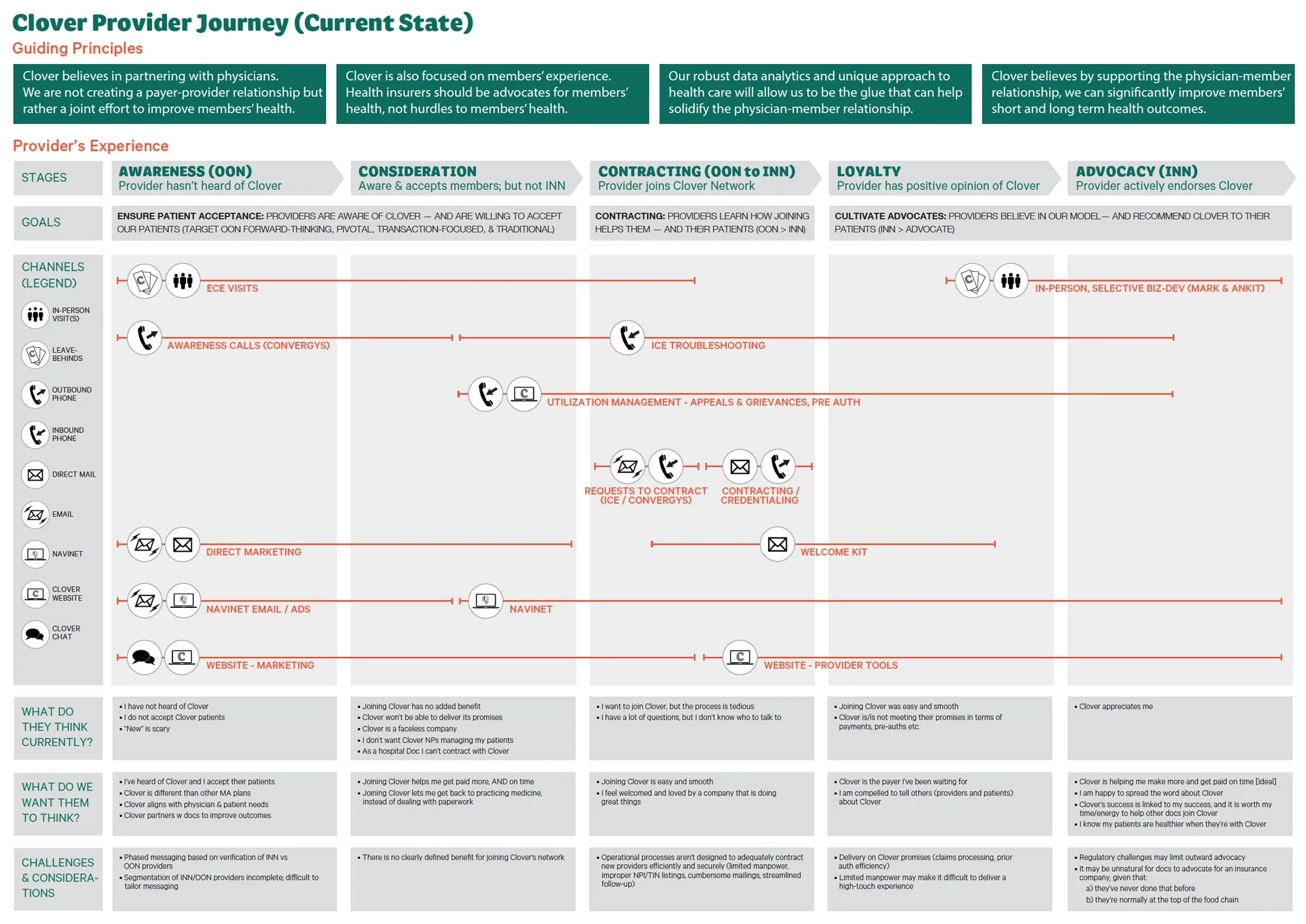
Mapping a Provider's Journey:
We developed this map with our Head of Provider Alignment. It shows 5 stages that Clover would like to step its providers through.
The vision is a network of providers that are so happy with Clover, that they advocate on our behalf; growing the network initially via referrals (and later via tech).


Above: 3 of the 5 Provider Personas were selected as short term targets. These elicited positive feedback, healthy debate, and provided value to other teams throughout Clover.
Step 2, DEFINE:
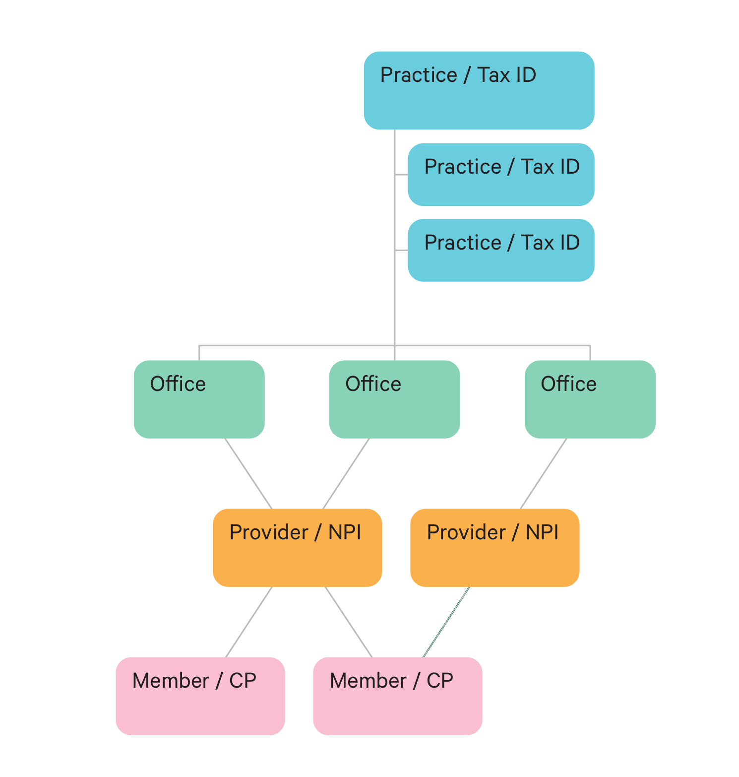
We explored how data "entities" might appear in the UI. For example, which providers get NPI's, Group NPI's or TIN's.
We defined V1 scope:
1. UI for managing provider data
2. Provider data service (both in/out of network)
3. Provider profile (editable)
4. Practice profile (editable)
5. Provider practice search
6. Get off of iNetworks; Clover own truth for in-network data
7. Tie provider to member data in Mission Control profiles
8. Connect to CredSimple for Credentialing
Hypothesis:
Our research and data/mental model discussions reinforced our philosophy of building lightweight, consumer-like tools. Also, changing to “plain speak” in the UI would align with how we were hiring; and would help newbies to ramp up.

Information architecture for including Provider content (red) into the preexisting framework. Based on research, we leveraged the mental model of a hierarchical Member Profile, into a similar structure for a Provider Profile, resulting in a more predictable, stable UX/UI.

Step 3, IDEATE:
Mindful of creating a scalable Platform Design for Mission Control (our centralized suite of tools), we sketched as many ideas as possible. The goal was to bring provider content into the overarching system, in a consistent, seamless way.
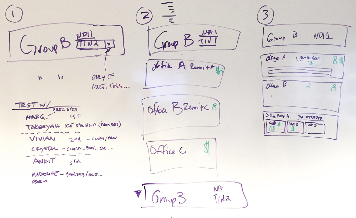
One of several ideas for surfacing data "entities" in the UI. The complexity presented unique challenges. For example, doctors that:
• practice at multiple locations
• practice different specialties at different locations
• belong to a group but also run their own practice
• practice at one location but do billing from another

While mindful of commonplace healthcare tools (for example, Epic), we were careful not to replicate any outmoded, clunky mental models, or cling to past jargon. We knew there are so many better, modern consumer apps to borrow from, in terms of a lighter weight, more intuitive approach.
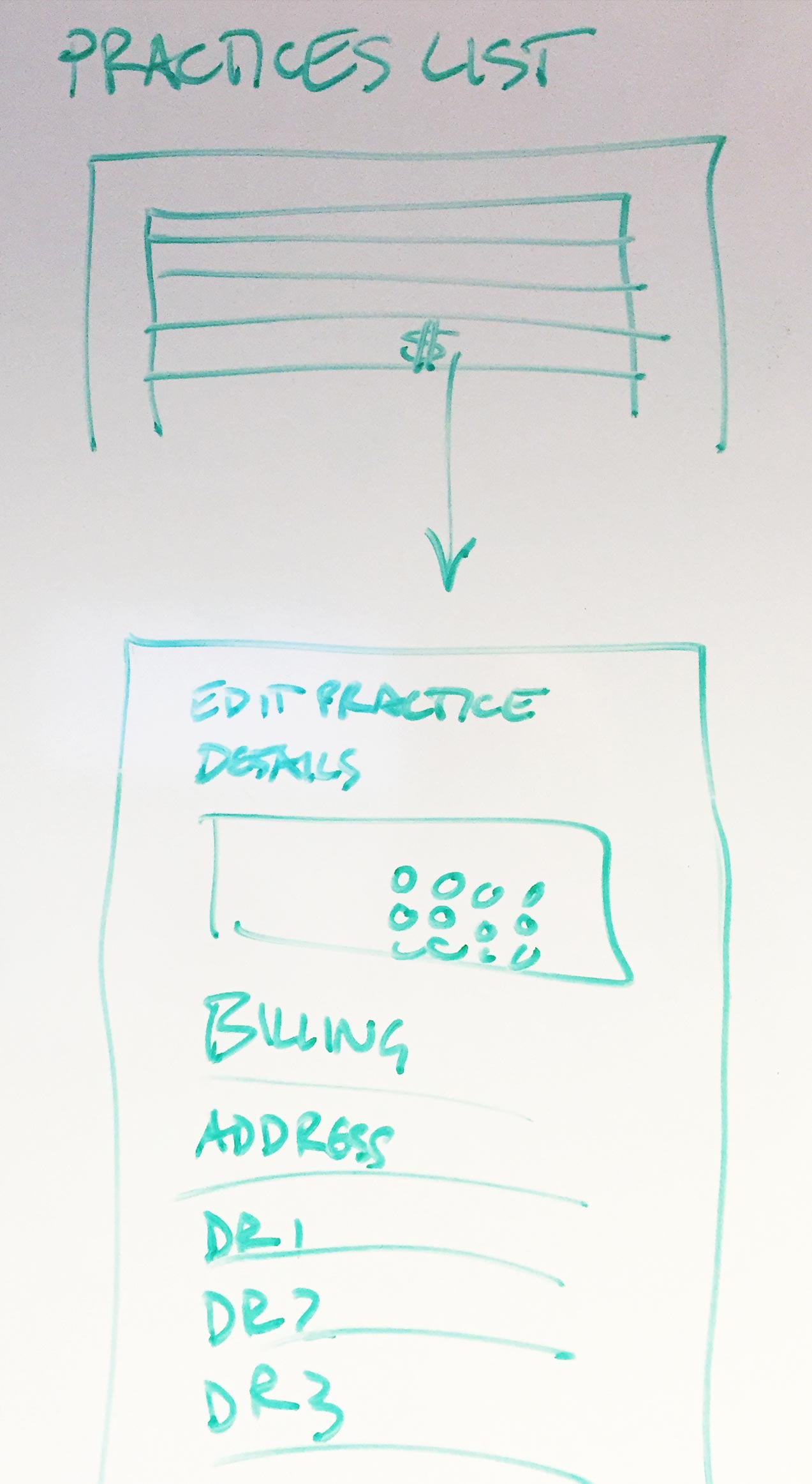
We leveraged our Platform Design patterns and design principles: starting tasks from lists (for simple actions), then diving into details (for complex actions).

A "cards" metaphor made sense for our "digital rolodex" (as some reps called it).

We came up with as many ideas as possible, and testing them as paper prototypes.
Steps 4-5, ITERATIVE PROTOTYPING & TESTING:
We tapped our Call Reps again, getting equal representation from veterans and newbies, being mindful not to oversample the same reps.
We tested each paper prototype direction for:
• IA/content structure
• main menu terminology
• navigation
• core task: find a provider
• core task: edit a provider's address
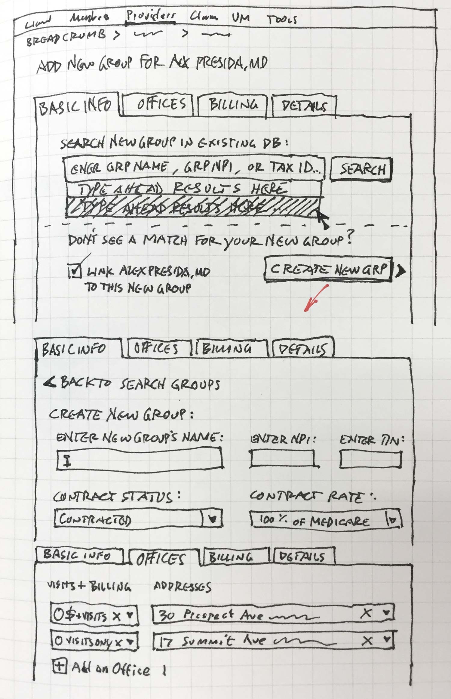
A rough sketch for Search, and Add a Group.

A more refined sketch for Search, showing micro interactions (type-ahead, disambiguation).
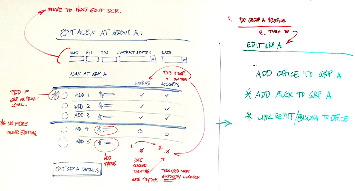
Editing was challenging due to the complex data model. For example, the nexus of "a provider at a specific location" (an intersection of two objects) was in itself an editable entity.

Wire-flows for:
• Editing a Provider at a Specific Group
• Editing a Provider's Basic Info

Mid-stage, high-fidelity wire for a typical Provider List (the starting point for most provider-related tasks).
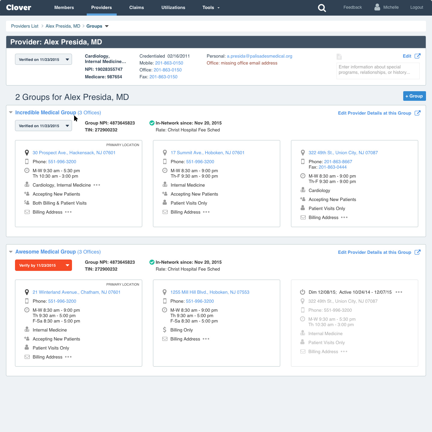
Mid-stage, high-fidelity wire for a typical Provider Profile (this provider practices out of 2 groups, each group has 3 offices).

Mid-stage, high-fidelity wire for Editing a Group.
We integrated with SmartyStreets in order to reduce human error. This shows the UI letting the Rep know that what they entered was found, and (slightly) adjusted.
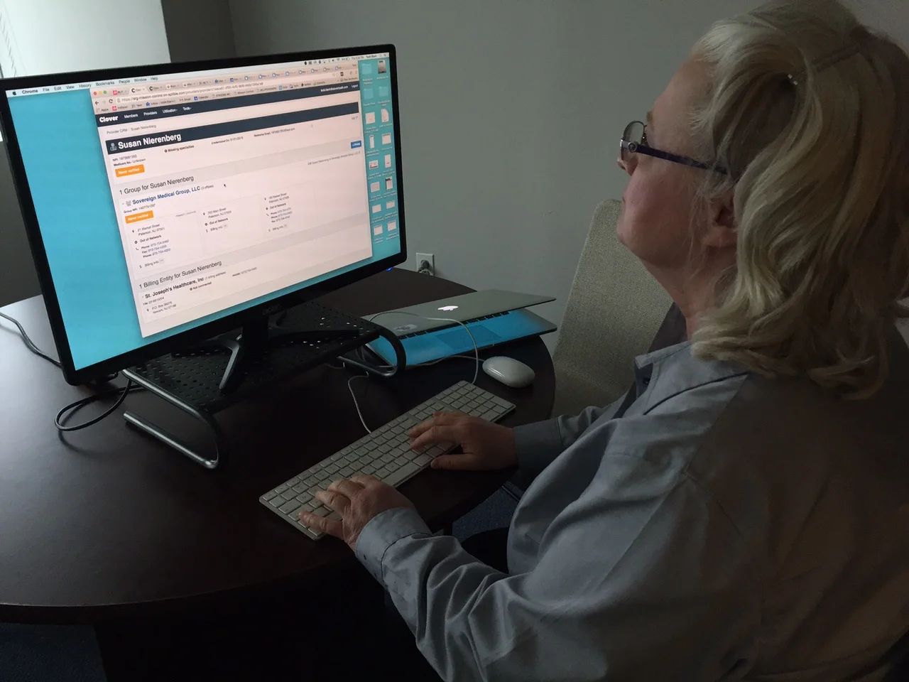
Later-stage testing: 8 Call Reps participated in one-on-one moderated sessions, with real data/software. We evaluated:
• Core workflows
• Design elements (icons, "cards" concept)
• Drill-down UX (List > Profile > Group > Office > Billing Entity)
"Feedback from T, A, and M was light, and overwhelmingly positive. They could find familiar providers, and (for the most part) immediately understood how the info was laid out; understood remit addresses and TINs too (a big concern)."
"Things worked as expected; we didn't get any huge surprises. Billing entities resonated with M and A because they've dealt with providers with separate TINs. Seeing contracts with TINs also made sense to all participants."

Late-stage, visual design for a typical Provider Profile; all cards collapsed...
And below, the same screen with all cards expanded.

Results

We were successful in hitting almost every goal:
• We centralized provider data into Mission Control, enabling crowd-sourcing, and accelerating improvements to the data.
• Clover receiving an independent agency ranking of "twice the industry standard" for accuracy of provider data.
• Better address data helped Clover route members to the most convenient doctor locations, improving outcomes; which also helped Clover pay Providers faster, at the right addresses.
• The improved quality of data has contributed to a higher stars rating; which drives higher revenue; and allows Clover more control over how they can advertise.
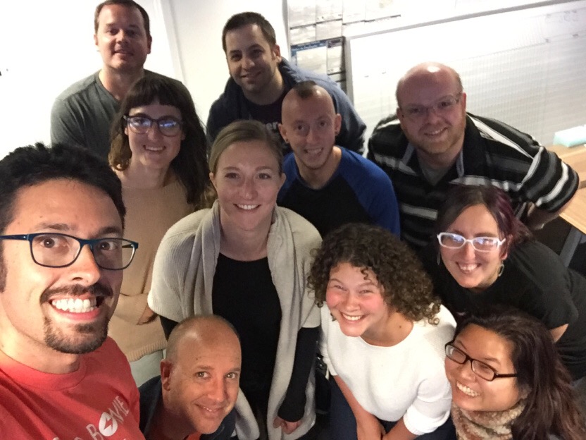
Our Provider Directory team.