
Member Engagement
Health-tech startup Clover Health needed an intuitive, scalable workflow tool that guided interaction for phone reps, and deepened engagement with members.
My role: Design Lead, User Research, Information Architecture, System Design, Prototyping, UX, UI, Visual Design
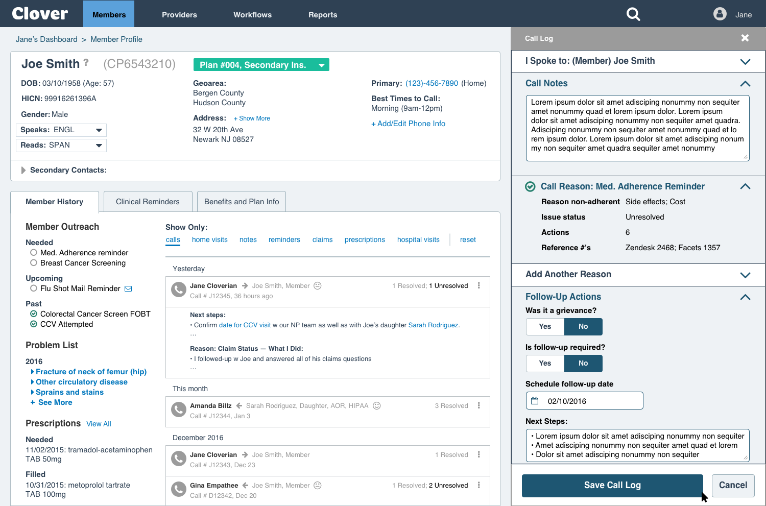
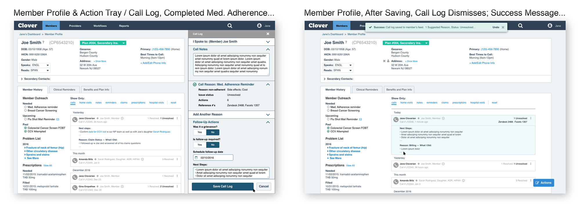
Below are some later-stage designs: a Clover Rep calls a member about medication adherence.

Objective
Campaigns involve Clover's reps, calling members to:
• Remind and track their adherence to medication
• Schedule in-home managed care visits with Clover nurses
• Schedule breast cancer screenings, and more...
Problems we're solving:
• Tools weren't integrated; reps juggled many "poor" tools
• Bad data put reps at a disadvantage, eroding member's trust
• Hard to resolve a member's multiple needs in one call
Design an integrated, scalable tool that:
• Improves efficiency and data quality; reduces human error
• Deepens engagement, captures the dialogue, builds trust
• Improves both Clover's revenue and member health

Challenges
Campaigns are big, complex:
• The Prior call-log UI wasn't intuitive (so reps did it by hand)
• Reps reassign verbally (no record of hand-offs)
• Non-linear workflow, varied across-teams (inconsistent UX)
• Data accuracy was a challenge (eroded member trust)
We needed to look at:
• Where to surface tasks for quick action
• How a workspace (e.g., a call list) can drive action
• How to capture task resolution (call log)
• How documentation supports new tasks (activity feed)

Approach & Process
After a kickoff with stakeholders (ops, product, clinical, design, customer experience), we ran smaller group follow-ups to:
• Confirm and align on our understanding of the goals
• Start to identify underlying causes of campaign issues
• Prioritize the must-haves and nice-to-haves
We then conducted individual interviews and observed call reps performing tasks. We began to develop a feel for their task flow.
We weren't just trying to make their jobs easier. We were more concerned with envisioning a system at scale: for example, within a year, Clover Health would be adding more call centers in new markets.

Contextual Inquiry:
• Google sheets get bloated and break within a month
• Inability to glean data trends beyond 1-month "slices"
• Requires Call Reps to multitask during member calls
• Ops people create these; but they're difficult for Call Reps to use

Contextual Inquiry:
When software doesn't work, people improvise solutions, like taking notes by hand — and transcribing their notes into the tool, after each call. This double-entry is painfully inefficient: human error increased when reps got inbound calls before they could transcribe their notes into the tool. We weren't setting our reps up for success.

Defining what to build:
We shared findings on Quip. The feedback resonated with both users and stakeholders. We probed further, identified underlying problems, and listed proposed solutions. Eventually this list became our spec. We then developed "how might we" questions to wrap up the define phase, and set the stage for UX/UI design:
Workspace / Follow-Up Call List:
• How might we offer reps a quick, actionable call list — with "just enough context" — to prepare them for calls?
• How might we use stats to excite and motivate reps — while increasing their call load?
• How might we empower reps to feel in control of their list — within "tight guardrails"? (customization v.s. scalability)
Call Logging / Action Tray:
• How might we optimize data ingest (for the business) — without creating a laborious call log form UI (for our reps)?
• How might we encourage one-call-resolution — while addressing multiple issues for a member?
• How might we surface training for new reps — without slowing call log completion times?

Design, Prototype, Learn, Iterate:
Moving into Design, we analyzed all campaign types and brainstormed possible frameworks. We ranked campaigns according to complexity.

We prioritized the most complex campaign: medication adherence. This way, our resulting framework would accommodate any subsequent, simpler campaign or task.
Additionally, getting medication adherence right would pay big dividends in terms of both member health — and revenue for Clover.
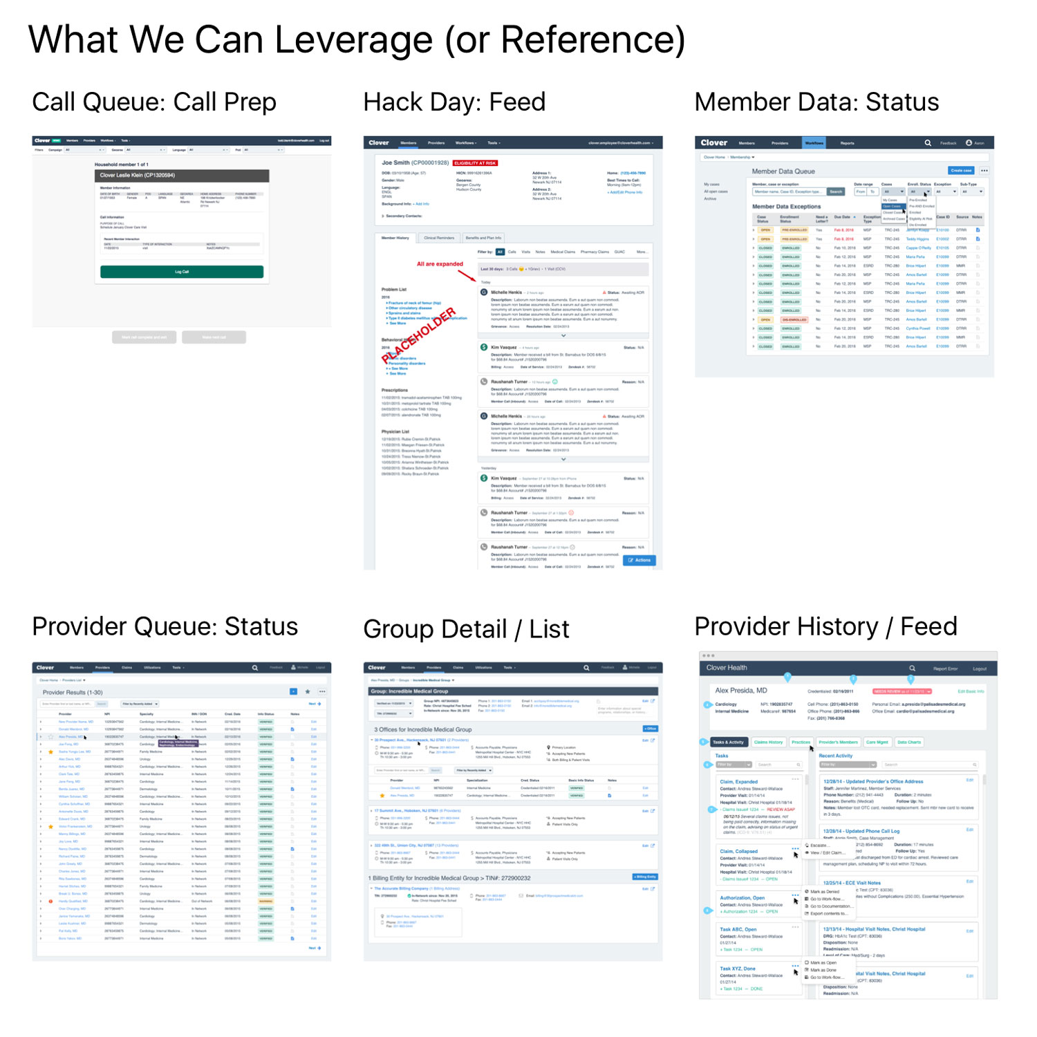
Armed with our discovery research, our "how might we" questions, and our analysis of campaign types, we took stock of our current "Platform Design" (our evolving framework for the whole of Mission Control).
We identified parts that could remain, and others that needed refinement, in order to ensure everything would have its proper place in the whole.
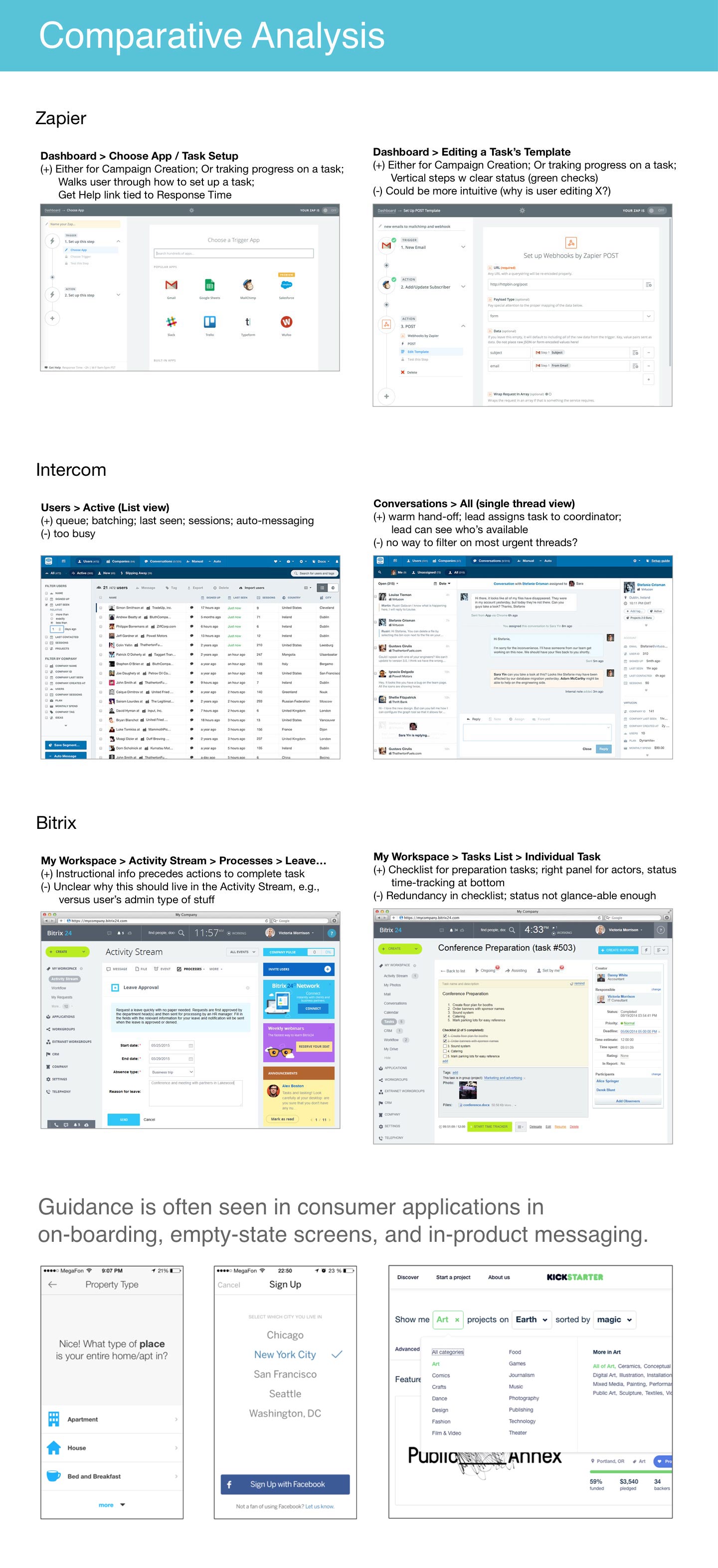
UX/UI in healthcare is typically clunky. More than half of hospitals report that they're unhappy with the usability of their EHRs.
Clover Health wants to change that. And fortunately now, there are many consumer apps to borrow from, in terms of lighter weight, more intuitive approaches.

The Basic Flow:
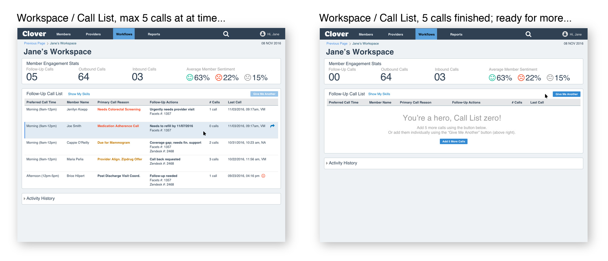
• Select a call (Workspace / Call List)
• View relevant call-prep info (Member Profile)
• Call member; complete campaign (Call Log / Action Tray)
• Handle impromptu member requests (Call Log/ Action Tray)
• See feedback that data was captured (Member Profile)
• Repeat...

A typical end-to-end workflow involved three components:
1) Workspace (Follow-Up Call List)
A new type of list page ("motivating stats" was new).
2) Member Profile (Pre-filtered)
The member profile had too much info. It only needed to show the relevant info for each call (each campaign type).
3) Action Tray (Call Log)
A panel that slides in from the right, to log calls. It existed but wasn't scalable.


Interplay on the Member Profile:
On saving a call log, the member profile gets a new record in its Activity Feed — a valuable reference for whoever is the next rep to help this member. The Feed, combined with improved ways to filter it, deepened Clover's insights into each member's "story."
The Feed also houses a growing data warehouse. Eventually, Clover will be able to ask more sophisticated questions of the data, adding predictive capabilities to their current preventative ones.


We explored various Call Log / Action Tray interaction models, weighing trade-offs between accordion, hub-and-spoke and other approaches.

A wire-flow showing end-to-end workflow. This model allowed logging multiple issues more easily, providing flexibility and scalability for call reps.
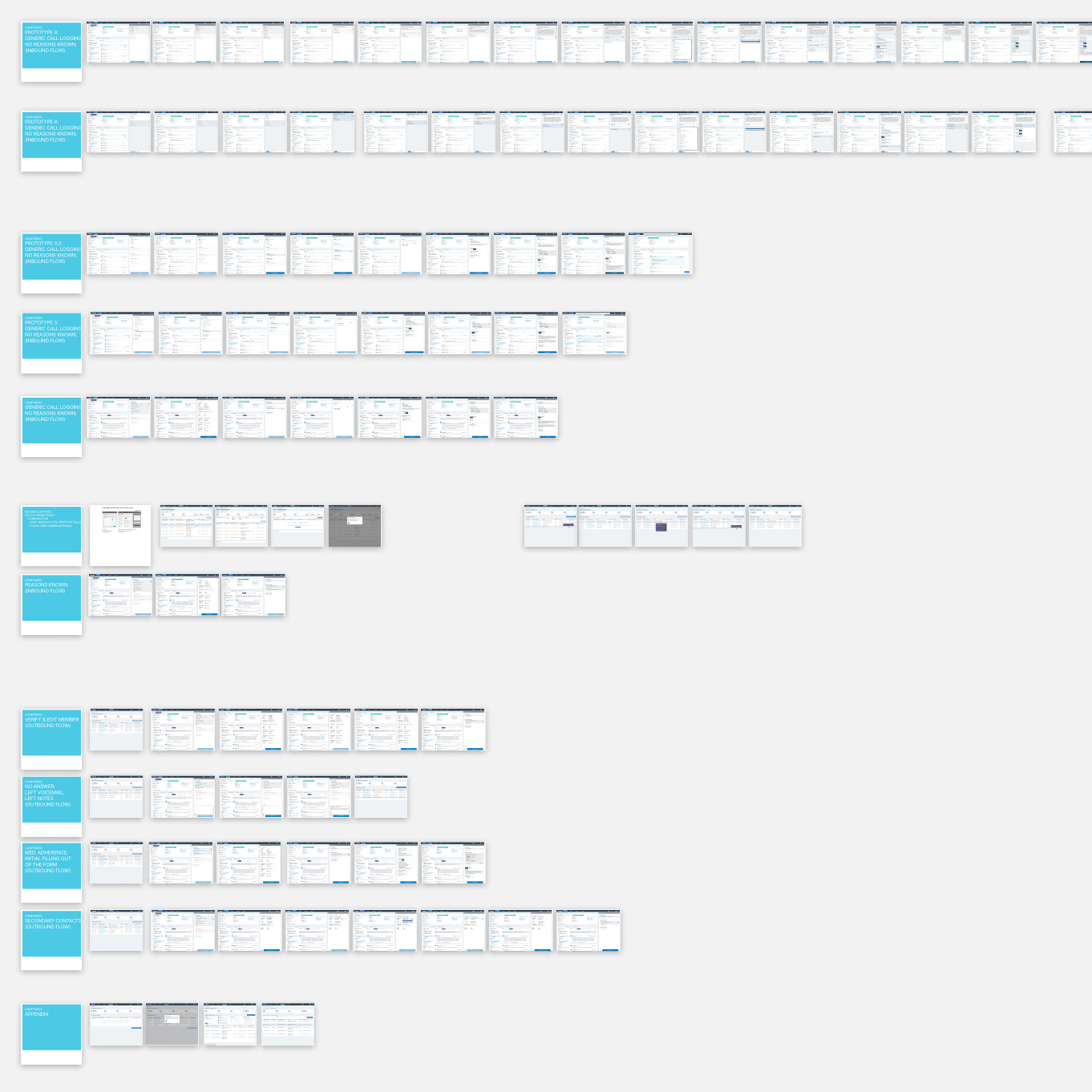
Our Invision prototypes were fine for evaluating basic flow and usability, but they lacked the ability to elicit the deeper insights that only actual data could trigger. To remedy this, we paired closely with engineering to create a series of rapid "throw-away" prototypes, with actual/dummy data.

Result
We took on an huge challenge "deepening member engagement” — from the seed of an idea, to a functioning prototype with a user-first perspective.
We budgeted more time for the Workspace and Action Tray, yet we were still able to deliver valuable "quick wins" for the Member Profile, which delighted reps:
• Improved filtering of the Activity Feed
• Ability to see a "Last 60 Days" summary per member
Iterative research and testing of end-to-end work-flows helped solve some crucial business problems. Team leads were invested in the process and excited about our progress.
The product, design, engineering and day-to-day user teams continue to evolve the product, based on this foundational system design.